If you are using R’s base graphics system for your plots and if you like
customizing your plots, you may have already wondered how to custom the tick
marks of your plots! I do that quite a lot and I thought it would be worth
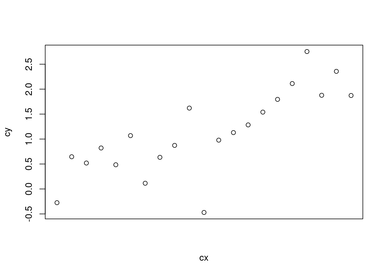
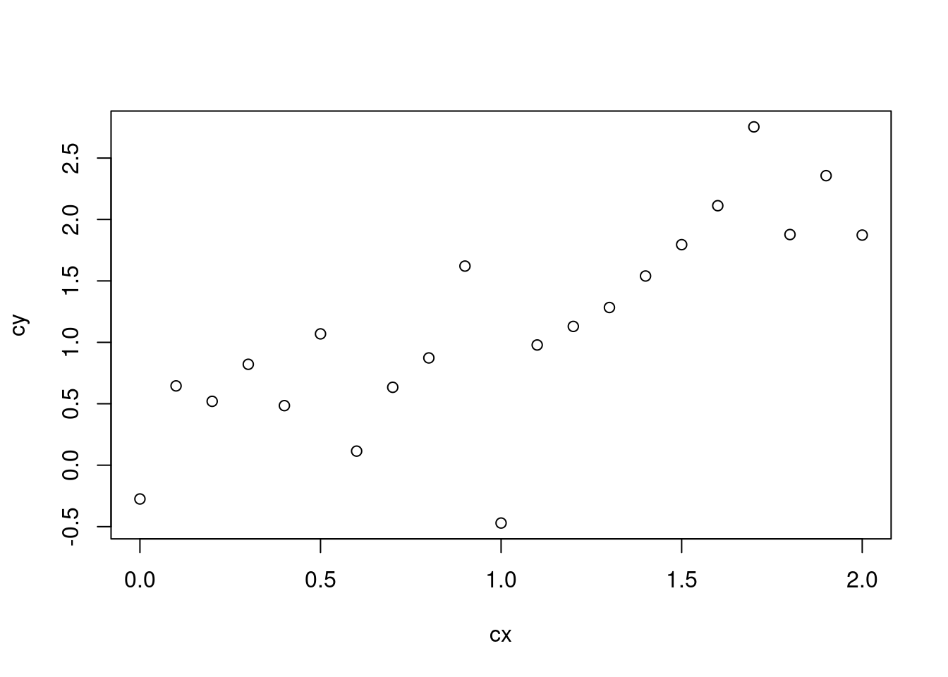
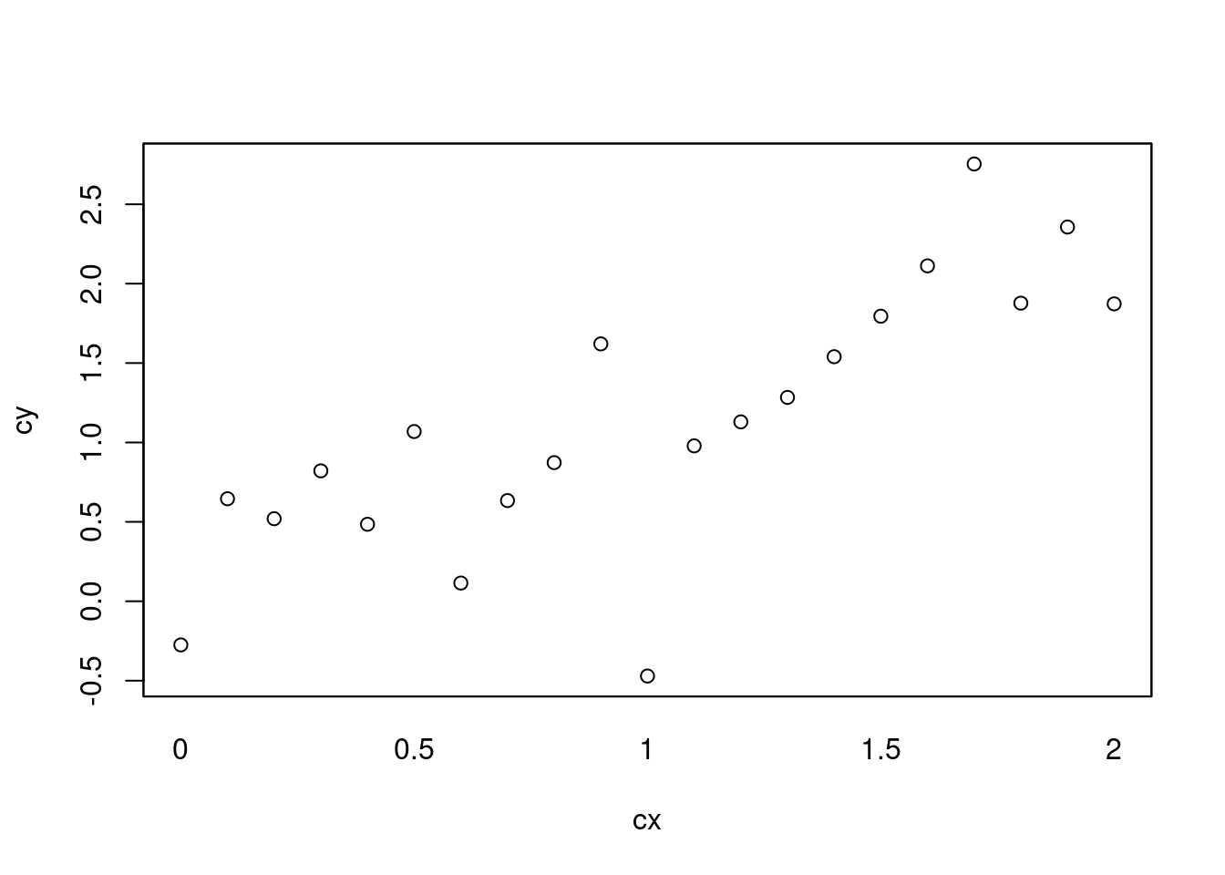
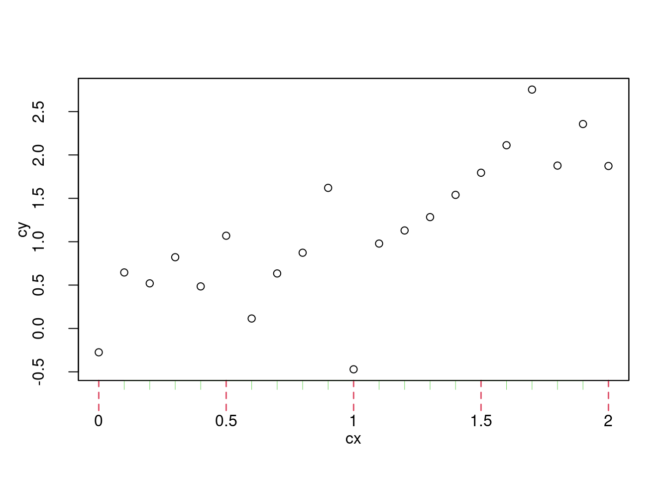
explaining how I do so. Let’s consider the following plot,
By default, plot.default internally has its way to decide where tick marks
should be added. It is always a good default choice, but sometimes not the one
you’re looking for. Fortunately, the core package graphics includes all what
you need to custom the tick marks and so, without further ado, let’s custom our
ticks!
Remove axes and add them back
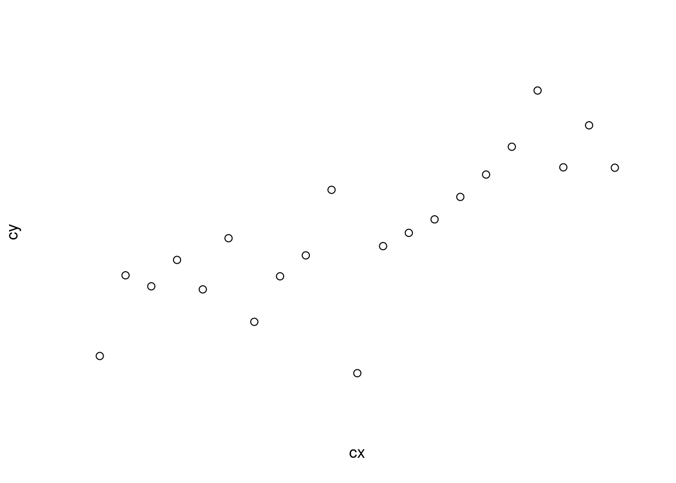
The first step is to remove all axes. There are basically two ways. One option
is to use xaxt = "n" and yaxt = "n" to selectively remove the x-axis and
the y-axis, respectively.
1
plot(cx,cy,xaxt="n")
1
plot(cx,cy,xaxt="n",yaxt="n")
The second option is to set axes to FALSE in plot():
1
plot(cx,cy,axes=FALSE)
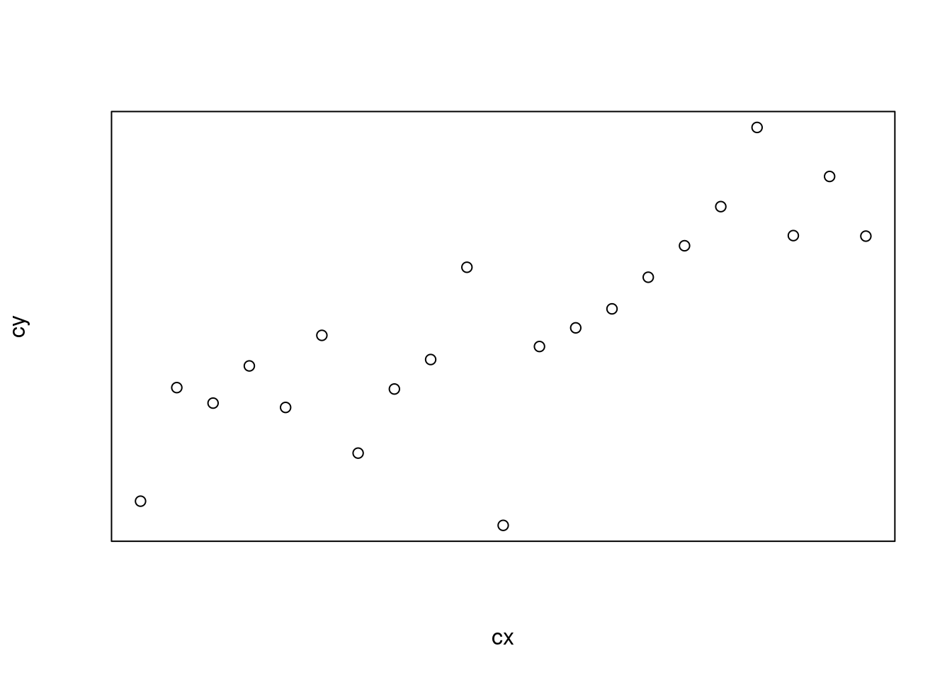
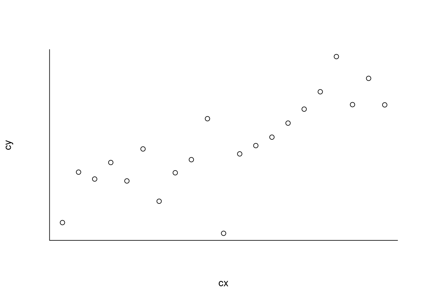
As you can see, when axes = FALSE the box is also removed and you can actually add it back with box():
1
2
plot(cx,cy,axes=FALSE)box()
and change its style, if desired:
1
2
plot(cx,cy,axes=FALSE)box(bty="l")
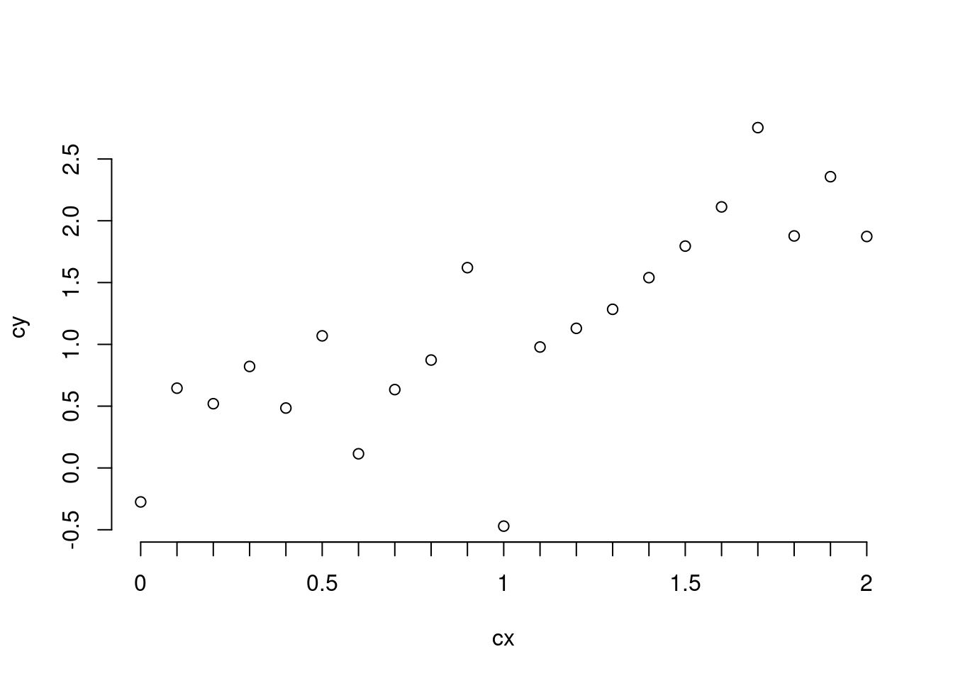
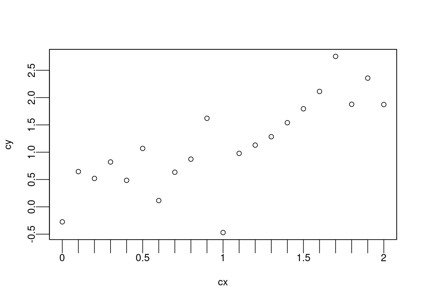
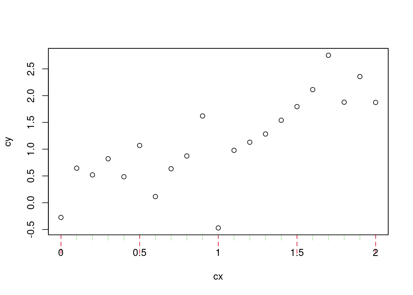
That being said, let’s only remove the x-axis for the moment and add ticks at 0,
0.5, 1, 1.5 and 2 to the x-axis using axis():
1
2
plot(cx,cy,xaxt="n")axis(1,at=seq(0,2,.5))
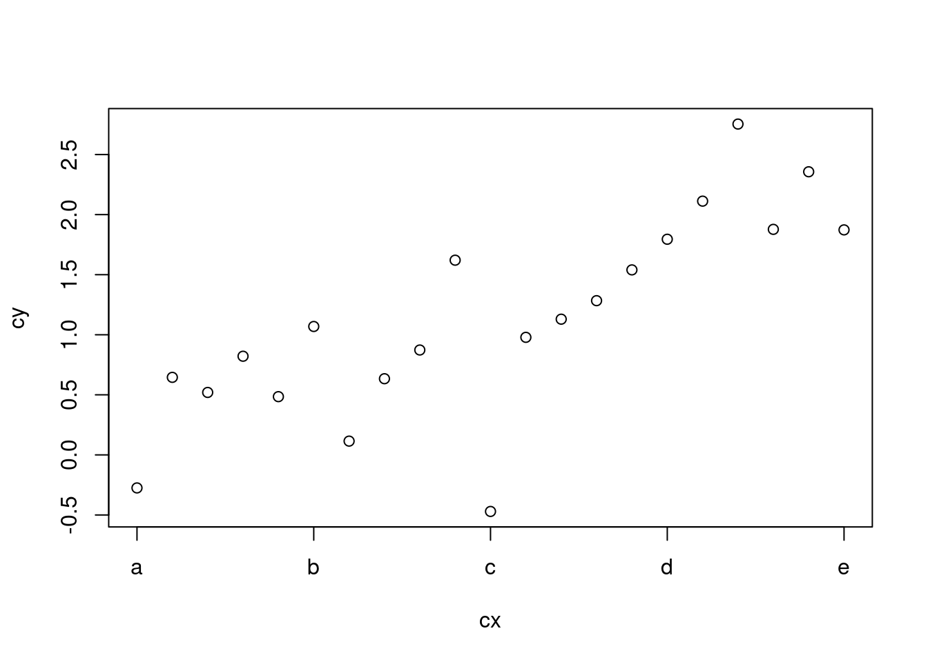
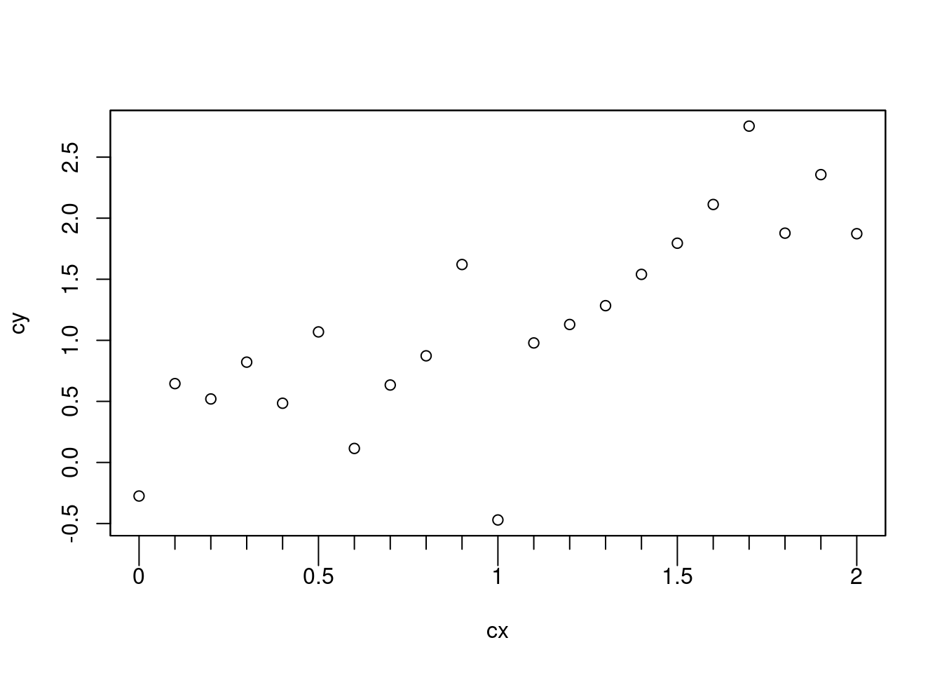
I can easily change the labels if values on the axis are not the ones that
should be displayed, e.g.
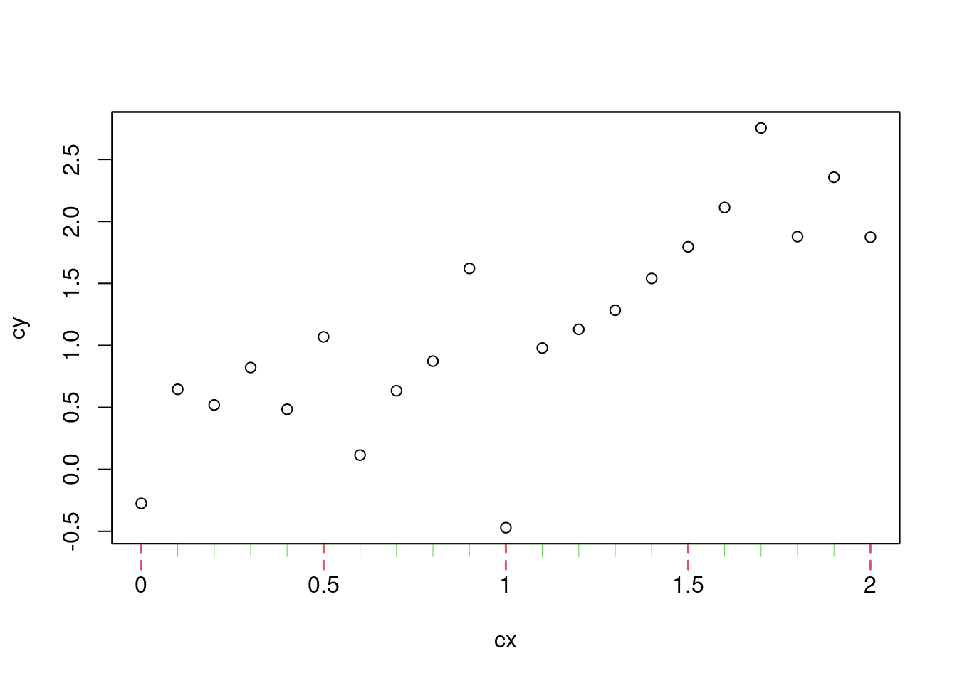
As you may have noticed, I use setdiff() to select the complementary set of
ticks. I think it is an efficient of proceeding: I first select the finest gap
between two ticks (here 0.1) and create the sequence with seq(), then create
the main set of tick marks and finally use setdiff() will to add the
remaining tick marks. Also here, as I don’t want to add extra labels, I just set
the labels to NA.
Remove the extra line
The main reason why I adjust the tick marks on my plots is because axis() and
box() add lines that partially overlap (this is also true when you use the
default behavior of plot()): the lines that comes along with the ticks
This may frequently goes unnoticed, but I personally tend to notice such overlap
this and it annoys me… Anyway, one way to handle this is to set the line width
to 0 in axis().
One more tip, if you need to adjust the position of the tick you would have to
use mgp (also documented in par) which is a vector of three elements
controlling the following features:
All the steps above may appear overwhelming at first because you need to
memorize where is what… But once everything gets clear, you would realize that
for most of your plots you need to tweak the same parameters and so that you can
create your own function that would cover your needs. For instance, I often use
a function similar to the one below: